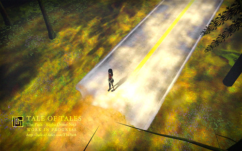
Click on the picture for a few screenshots.
These are screenshots of the first phase of the iterative design process we use for development. Basically what we did is create the environment in which most of the game will take place, a first version of the most essential characters, and the interaction systems we had designed beforehand and some that we came up with during development. As you may know from reading this blog or playing our games, we are not very interested in typical game-style interactivity. This is why we don’t simply execute and fine-tune an existing interaction design.
The demo we have now made is more a testbed for possibilities than a prototype for a game. It is used for figuring out which interactions work and which don’t. Which elements enhance the narrative and which don’t. Etcetera. As such it is a tool for internal use more than a public demo.
We have tried to achieve a certain level of polish that may be inappropriate for a pure prototype. We did this on the one hand because aesthetics are very important in the games that we make. But also because it helps us to critically evaluate our work before we move on. We’ve had bad experiences in the past with blocked-out worlds feeling really great and then being disappointed by the fleshed-out version. When the prototype is too symbolic and contains too much placeholder assets, our minds tend to make up too much for things that aren’t there.

The more I see of this the more I get freaked out. Playgrounds and shadow-people and needing a hug…
Looking good, anyway. =)
This is the kind of artsy brilliance that I love seeing. Well met friends!