Sunset is by far the most complicated thing we’ve created in Unity. When we made our first Unity game, The Graveyard, we quickly realized that the tool was only going to be useful to us for making simple games. We came from the grand luxury of realtime visual programming offered by Quest3D with which we, artists and programming idiots, had built a multiplayer online game (The Endless Forest) and a horror game with semi-autonomous characters (The Path). The fact that Unity only offered script-based programming immediately meant that we had to dial down our ambitions. Our artist minds can perform magic with visuals but code makes our brains hurt. And compiling is the death knell for realtime creativity.
Luckily in the mean time, the problem has been alleviated somewhat by Unity add-ons that at least offer the possibility to program visually (although realtime non-compiled programming is still not possible to my knowledge). Bientôt l’été was programmed with Antares Universe and then recoded in Javascript for performance. Luxuria Superbia ditto. Since we didn’t like having to recode things, we decided to give PlayMaker a chance when we started programming our first prototypes of Sunset.
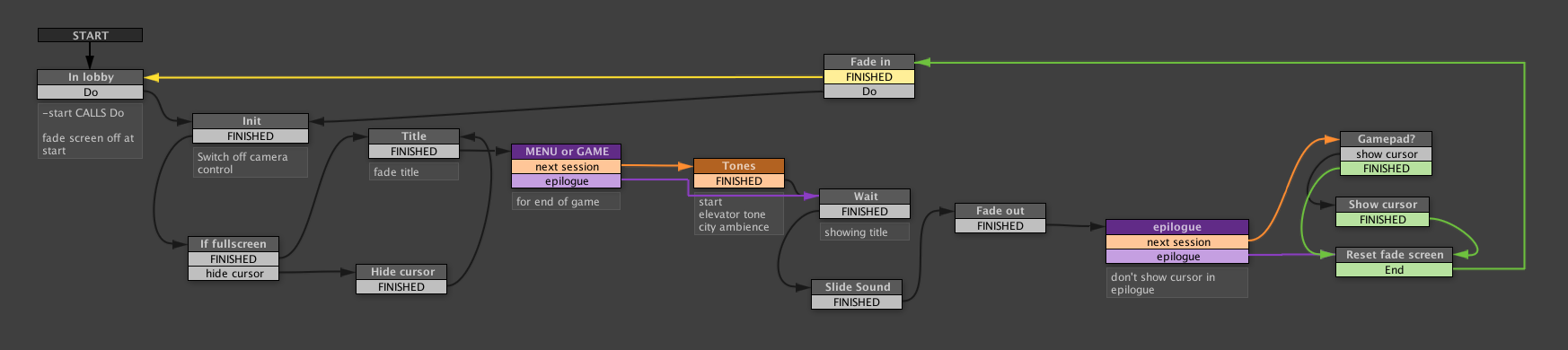
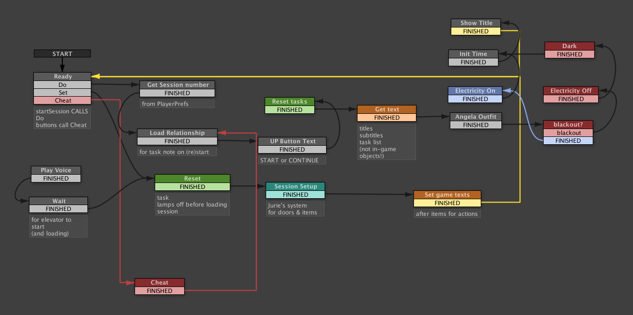
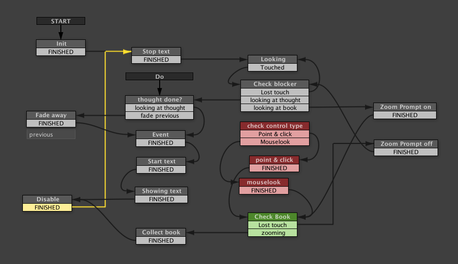
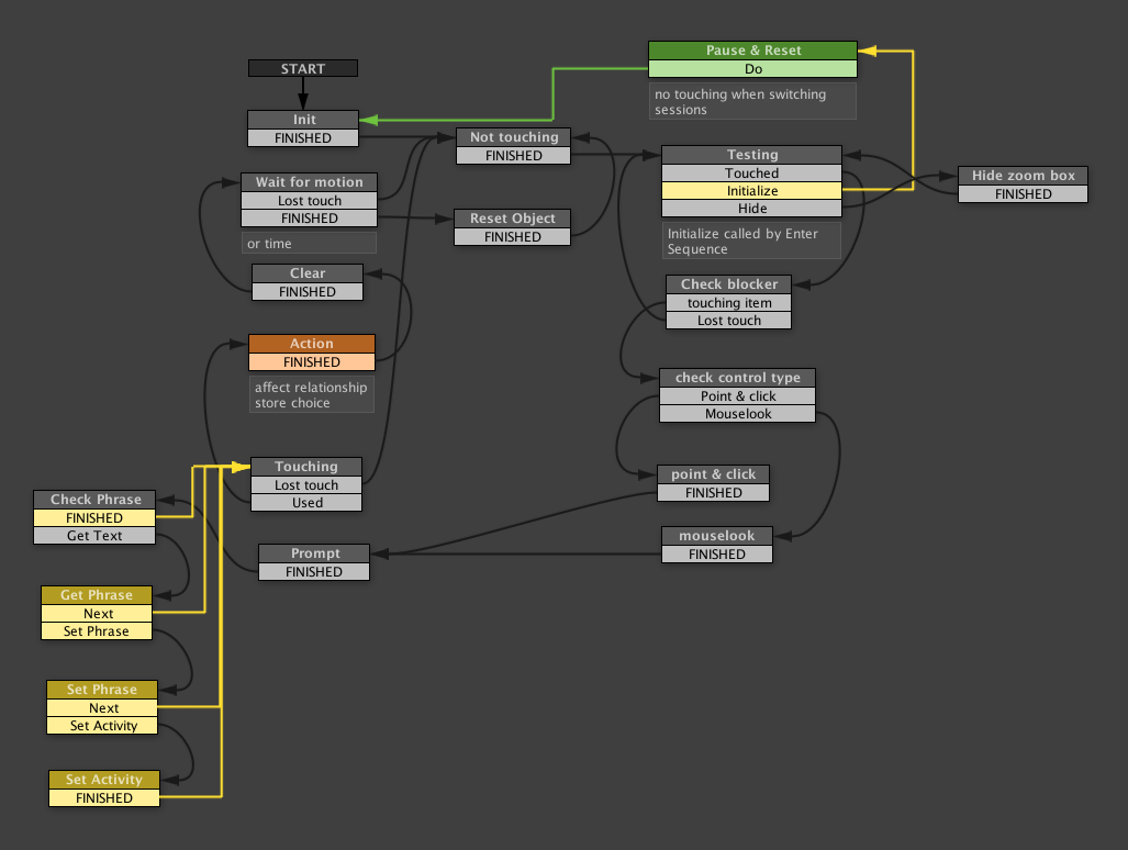
In the end we used a combination of PlayMaker FSMs, Javascript and C sharp code to make the whole thing run. Code looks infinitely boring and is hard to read but PlayMaker’s Finite State Machines make programming clear and fun. And the fact that it doesn’t need to check whether we put all our semicolons in the right places or didn’t misspell something means it’s a lot faster to work with (Unity’s recompiling of scripts each and every time you make the slightest change is quite unnerving in a big project like Sunset).
Spoilers!
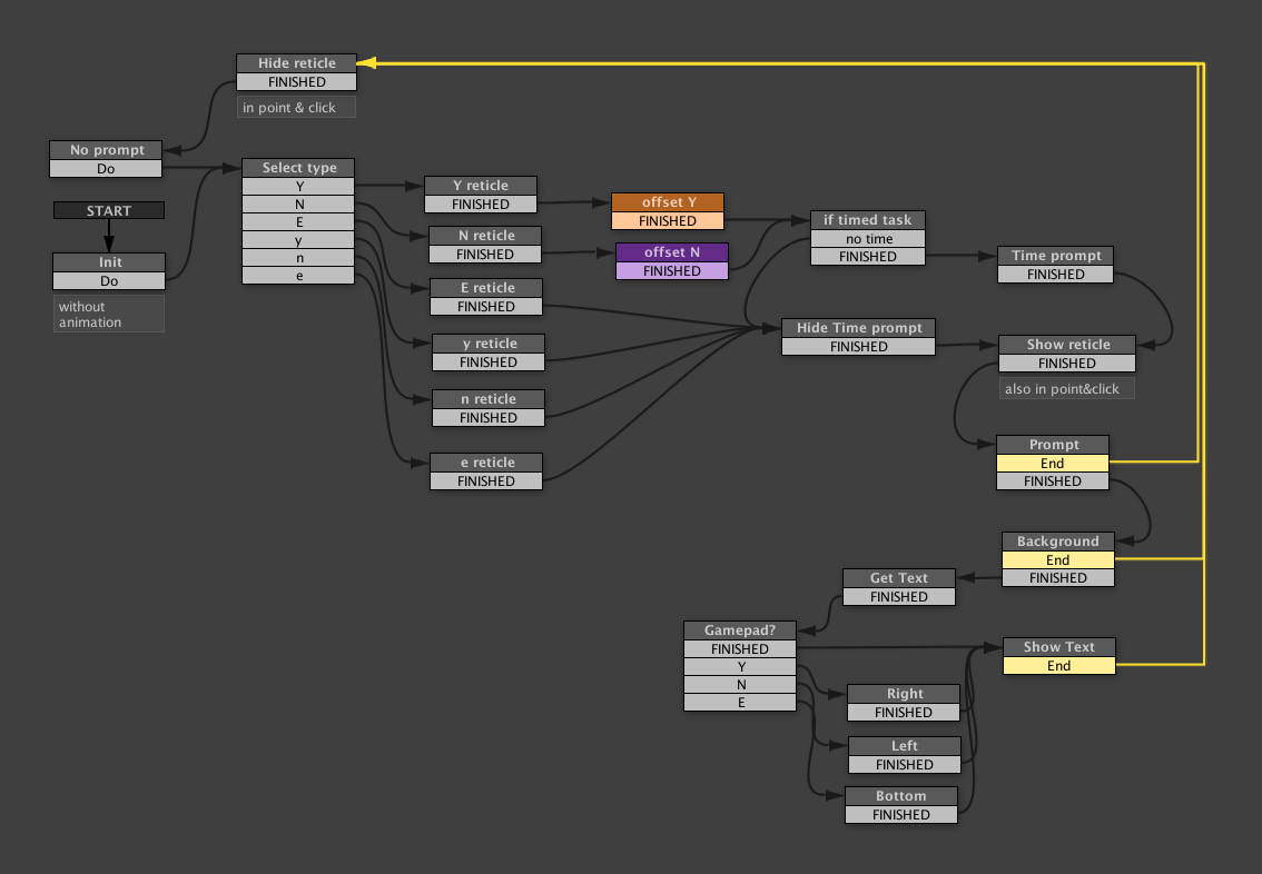
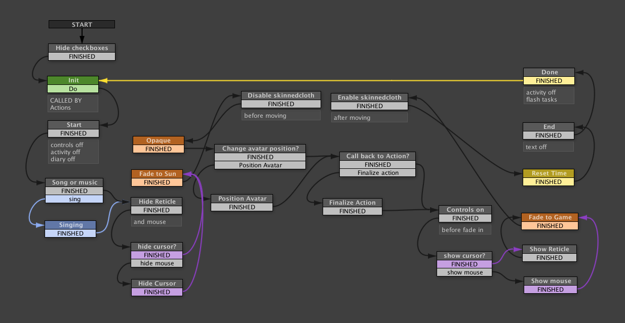
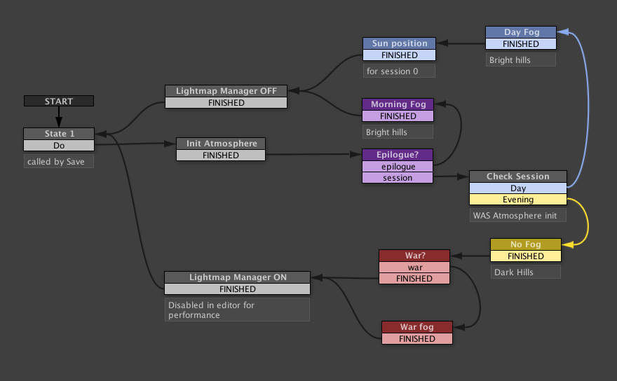
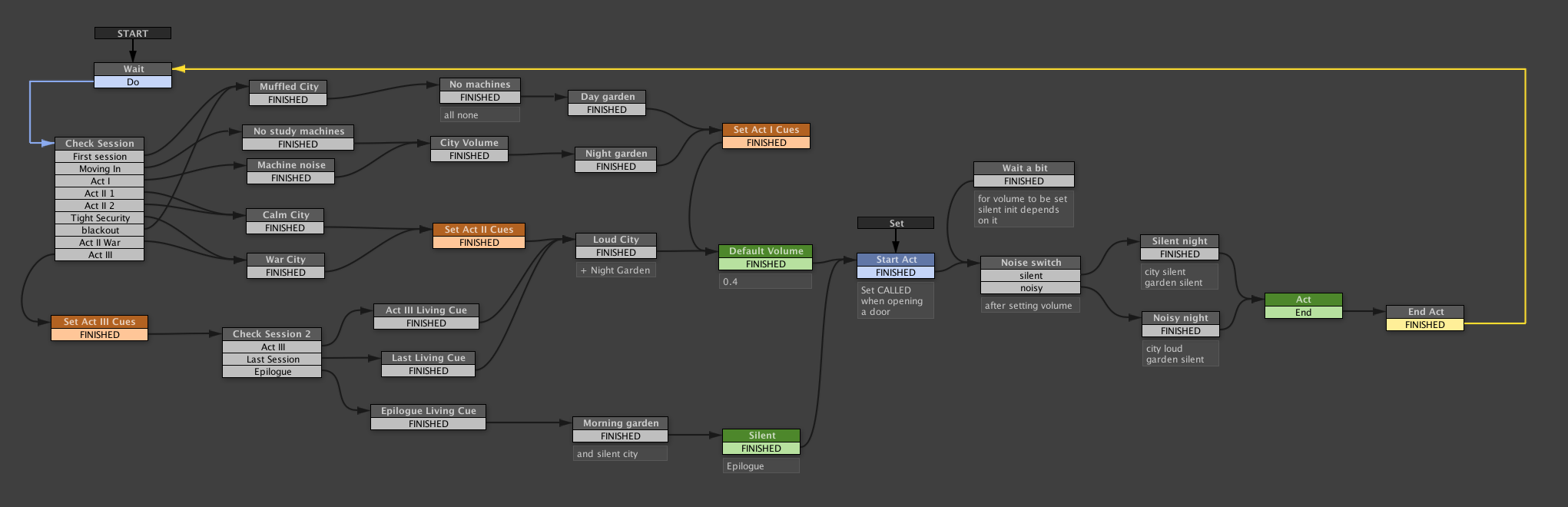
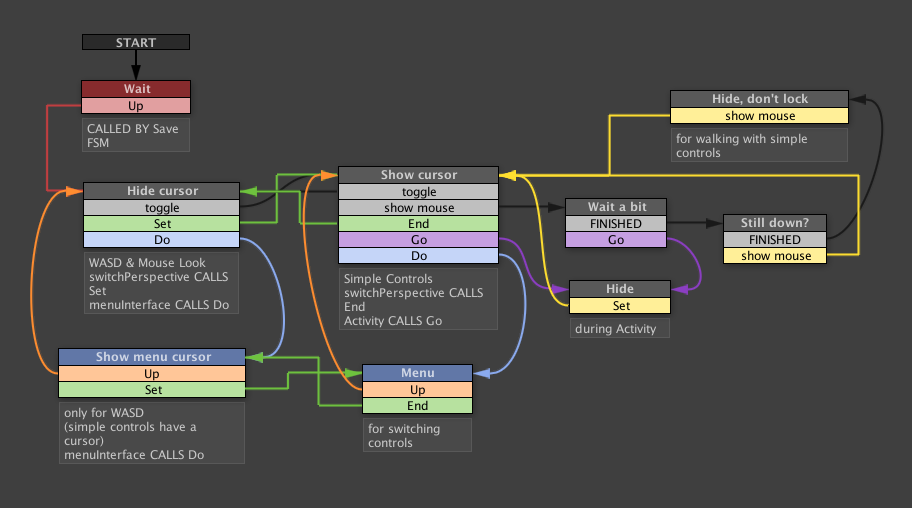
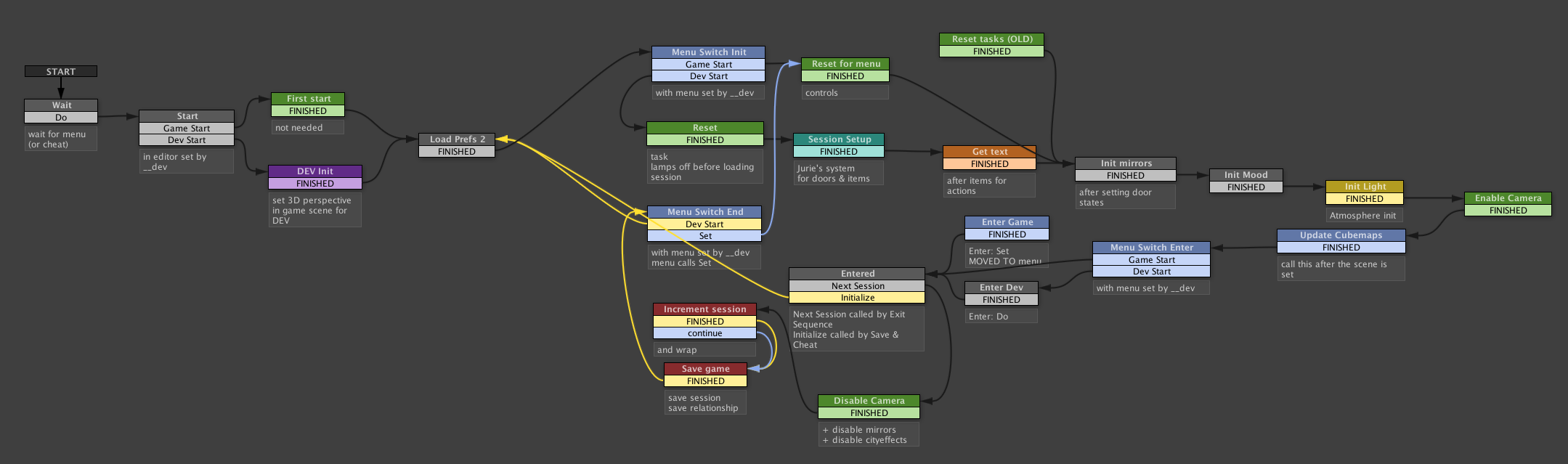
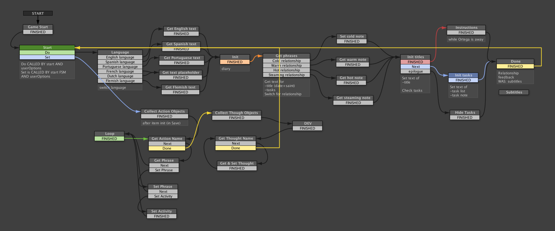
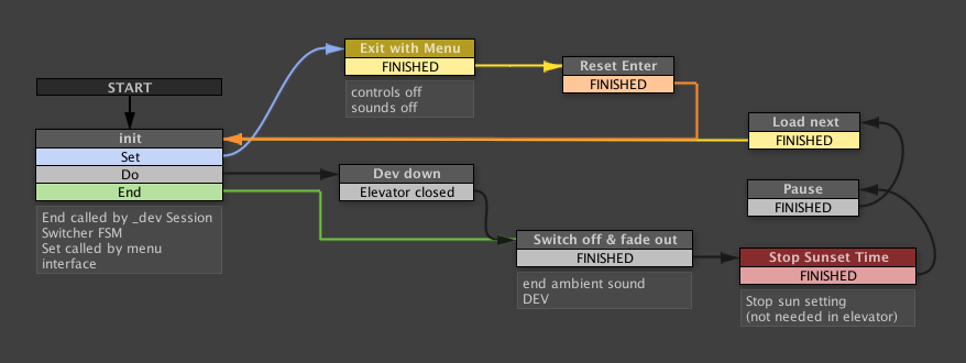
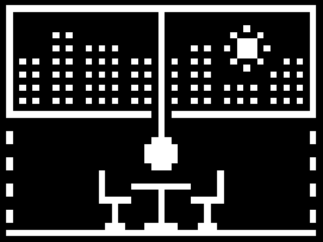
So here’s some of the state machines that make Sunset tick.
This is the title screen that shows the date of the session that is about to start.This is what happens when a session starts. Spoiler warning: ignore the right side of the graph if you’re not very far in the game yet.This is the logic for looking around and thinking about things in view. The red blocks are actually not used anymore.Similar to the above, this is the logic for touching things that you can interact with. The yellow blocks on the left are a backup in case the object doesn’t know which text to show.Depending on the kind of thing that you touch, you get a different prompt.This is the logic that runs when you’re doing a task, while the game shows the sun setting faster.This pretty graph is run in the beginning of a session to initialize the time of day.To evoke a sensation of silence, Sunset uses a complex system of ambient room tones.This one helps us switch between standing up and sitting down. Had a lot of trouble with this little bugger.Deciding when to show the cursor and when to hide it is more complicated than one might expect.I love this one. The logic called at the beginning and the end of a session. It used to do a lot but many of its former functions got delegated.This is how you parse text visually. Drives real programmers crazy.And finally here’s how you exit a session, when you’re all done working for señor Ortega.
I love how visual programming gives me an overview of the logic that helps me decide whether it is correct. Maybe it’s superstition but when a graph looks pretty I think the logic runs better. A good looking state machine cannot have bugs.
Obviously some of the things above would be faster to program in code. If you know what you want before you start. And if you can keep a big game like Sunset in your head. But when experimenting or just forgetting about certain things, to me these graphical representations are much easier to read and much “lighter on the brain”. The excessiveness of some of the graphs helps me think about the logic. And the fact that you simply cannot make any typos in PlayMaker is a huge time saver. Now if they would only add realtime programming to Unity…
I have a theory about decades. In terms of style and spirit, decades don’t start in the ’00 year but only halfway through. And they last until the middle of the next decade. So what we think of as “the nineties” actually only started in 1995 and lasted until 2005. Similarly the seventies as we know them, only really started in 1975.
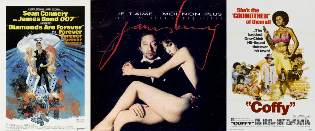
Sunset is set in 1972. So, according to my theory, it takes place in the style and spirit decade of the sixties, not the seventies. And we have definitely embraced that in the game.
In 1972, there was no punk, there was no disco. We listened to crooners, soul and psychedelic rock. The Beatles released their last album in 1970. And Diamonds Are Forever was the most recent Bond movie in 1972. Pong was released in 1972. And LCD screens had just made their appearance on the first digital watches. The wide-body Boeing 747 jet airliner with its glamorous upper deck had only been around for a few years. And the VW Beetle was the car that everybody wanted. Cassettes and video tapes had just been invented. But vinyl records were all the rage.
1972 was the year the first Godfather movie was released, and Cabaret, and Deliverance, and Solaris, and Last Tango in Paris, Hitchcock’s Frenzy, Fellini’s Roma and Godard’s Tout va Bien. And of course also Super Fly, with the wonderful soundtrack by Curtis Mayfield (Pusherman! Freddie’s Dead!). Star Wars did not exist. And the first Emmanuelle film would only be released 2 years later.
Style
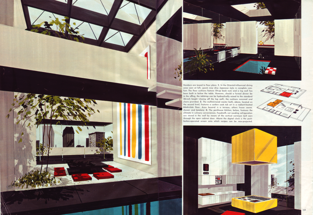
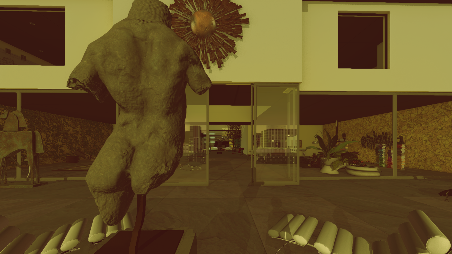
In architecture and design, the cool sixties still reigned supreme, with a touch of space age and a love of gadgets. Designers were fantasizing about multiple tv sets, remote controls, video intercom systems and even mini-computers that would control the lighting from central control panels hidden behind the seats of your sunken living room with wall to wall shag carpet.
We more or less literally copied this design for the ultimate bachelor pad from a 1970 copy of Playboy magazine.
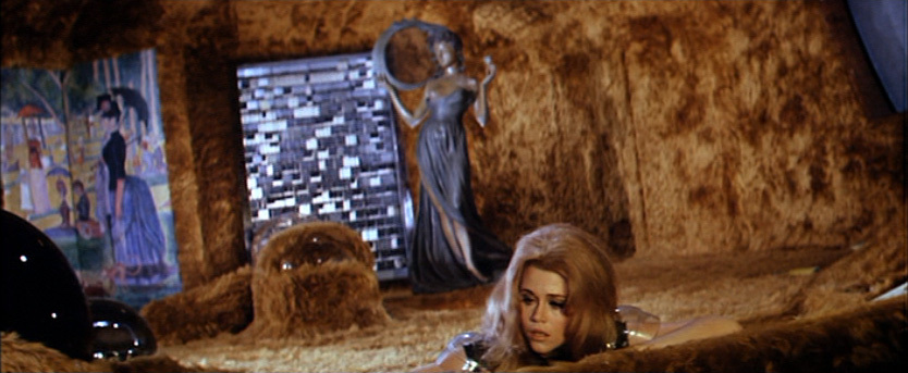
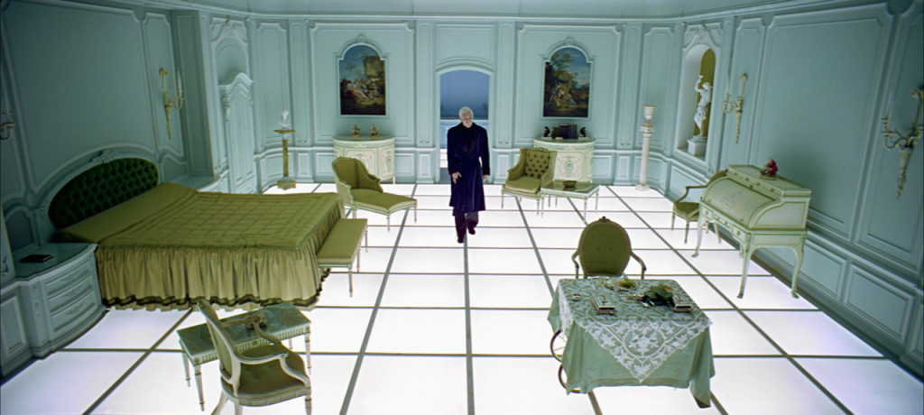
But the eclecticism that the seventies would become known for had already started, premonitioned in 1968 in Vadim’s Barbarella and Kubrick’s Space Odyssey. So next to your plastic phone and your dropped projection screen, you would have a baroque chair and an African statue.
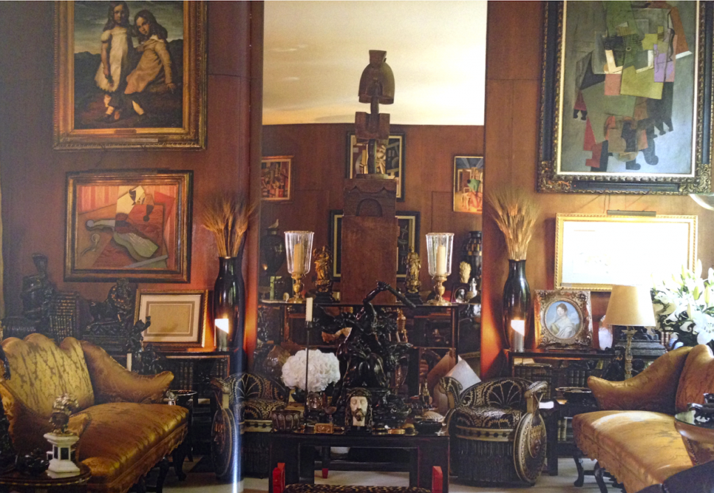
And if you had money you’d combine this with modernist paintings and Art Deco furniture, as Yves Saint Laurent did in the apartments that very much inspired Sunset.
Sex and Race
The revolutionary spirit of the sixties was still alive and well in 1972, despite of the commodification of hippie culture. Angela Davis was finally released from jail in 1972, only to be followed by Assata Shakur the year after. Nixon visited China in 1972. Right before the Watergate scandal. Pinochet took power in Chile in 1973. The Vietnam War was still going on.
This tension between the sneaky authoritarian elite with its conservative morals and a new generation that wanted to see the much touted ideals of liberty and egality realized for all was also very apparent in two phenomena that are incredibly confusing to our present-day “with us or against us” mentality. And therefore endlessly fascinating to us: blaxploitation and objectification.
The summer of love had left 1972 with an ambiguous relationship between the genders. On the one hand, we were all each other’s sex objects. But on the other it was mostly women who were presented as sexy and attractive. This still very much fit within the centuries-old equation of beauty with femininity. But it got a raunchy edge and the behavior of James Bond towards his Bond girls or Derek Flint’s women flatmates is on the verge of intolerable to our contemporary morality. Yet women didn’t seem to mind and played along gladly. Jane Birkin did not appear to be suffering under her relationship with Serge Gainsbourg. And Pam Grier triumphs in every one of her movies, even if she flaunts her impressive bust in the process.
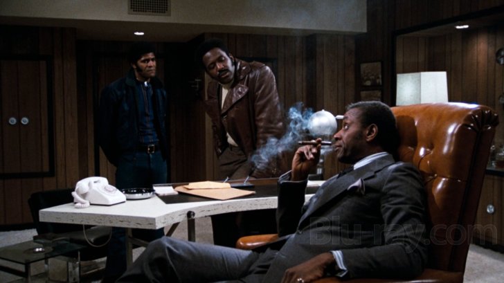
Which brings us to blaxploitation. On the one hand, it’s a sheer delight to see films where black people are not thrown in as tokens to teach kids to “not be racist” but where everyone just is black and flaunts their blackness. But our modern minds can’t help but feel a bit uncomfortable laughing at the silly jokes about stereotypes, knowing that the source of this humor is actual everyday racism that still exists in reality and gets people gunned down in the streets, even today, because of the color of their skin.
But no matter how complex and ambiguous, I think it is worthwhile to make an effort to enjoy, both beautiful women and cool Black Americans. Much better than to pretend that we don’t see the difference, which I fear often leads to in-difference (and the hiding or ignoring of problems rather than addressing them). Vive la difference!
When creating a videogame independently with a fraction of the budget of the blockbusters, a major concern is always how your game will look and compare to those popular games. There’s a sort of arms race going on in commercial videogames where big companies try to outdo each other in terms of aesthetics. They continue to up the ante in realism, detail, spectacle, and so on. As an independent developer you can only really stare at that with open mouth in utter awe. This must be how people in Antwerp must have felt like when they first saw Rubens’ work. Or here in Ghent when they encountered the Van Eyck altar piece in Saint Bavo’s cathedral.
The popular solution to the impossibility of competing with that stuff (simply because indies don’t have that kind of money) is to go retro. Making your game look old on purpose is a huge time saver and taps into the audience’s nostalgia. This would have been an interesting area to explore for Sunset, especially given that Sunset is set in the year that Pong was released: 1972. But we decided against that.
Sunset: The videogame, in 1972.
The thing is, we absolutely adore Rubens and Van Eyck. And this sort of aesthetics is what drew us to videogames in the first place. We want to make art with places that you can visit and characters you can relate to. We want to feel the lushness of the environment and immerse ourselves in the atmosphere. But could we afford it?
More is less
After paying close attention to our own reactions to aesthetics in videogames and reading about those of others, we discovered something remarkable. For all the effort put into realism, paradoxically it seems that to closer a game gets to it, the less players care about it.
When you think about it, it makes sense. We play videogames to surround ourselves with an imaginary world, to basically get away from reality for a while. So when a game starts looking like that reality, we tend to ignore it. At the initial first encounter, there we may go “wow”. But a few realistic trash cans and true-to life palm trees later, we tend to stop feeling so impressed.
I’m not going to argue that the effort was wasted. The effect of that initial wow-factor is not to be underestimated. But this observation did seem to offer us, underfunded indies, an opportunity.
Art in the cracks
It wasn’t just practical reasons that drove us to stylization in Sunset. Conceptually, realism is easy. This is probably one of the reasons why it’s so ubiquitous in a field where technology dominates. Copying what you see is a straightforward idea and offers a clear goal to compare your efforts to. When done literally, there’s no artistically creative thinking required.
But, as noted above, absolute realism is also absolutely dull. We are human, we like to feel connected to other humans. When we look at a picture, we like to notice the presence of its creator, if ever so subtly. We enjoy noticing how the artist solved a certain presentation problem. Maybe because it tells us something about the person who made the picture, or about what they were trying to evoke. Or simply because it reminds us that the image was created by a human like ourselves, not a machine.
As classicists we can appreciate the inclination towards realistic figuration in videogames.
I have this theory, somewhat derived from something that Raph Koster said in Theory of Fun, that art happens exactly where realism is lacking. It is where a picture deviates from reality that the art expresses something, that the cosmic divine is allowed to peak through.
This doesn’t mean that completely unreal images immediately have a better effect. The tension between the abstract and the real seems to be pivotal. I deeply enjoy being fooled into thinking something looks real only to find out on closer inspection that it isn’t at all. Especially when the abstraction is meaningful in some way.
A realistically modeled object is easily identified and ignored. But something that doesn’t look quite real invites investigation. If only because our mind wonders “Why can’t I ignore that thing?”
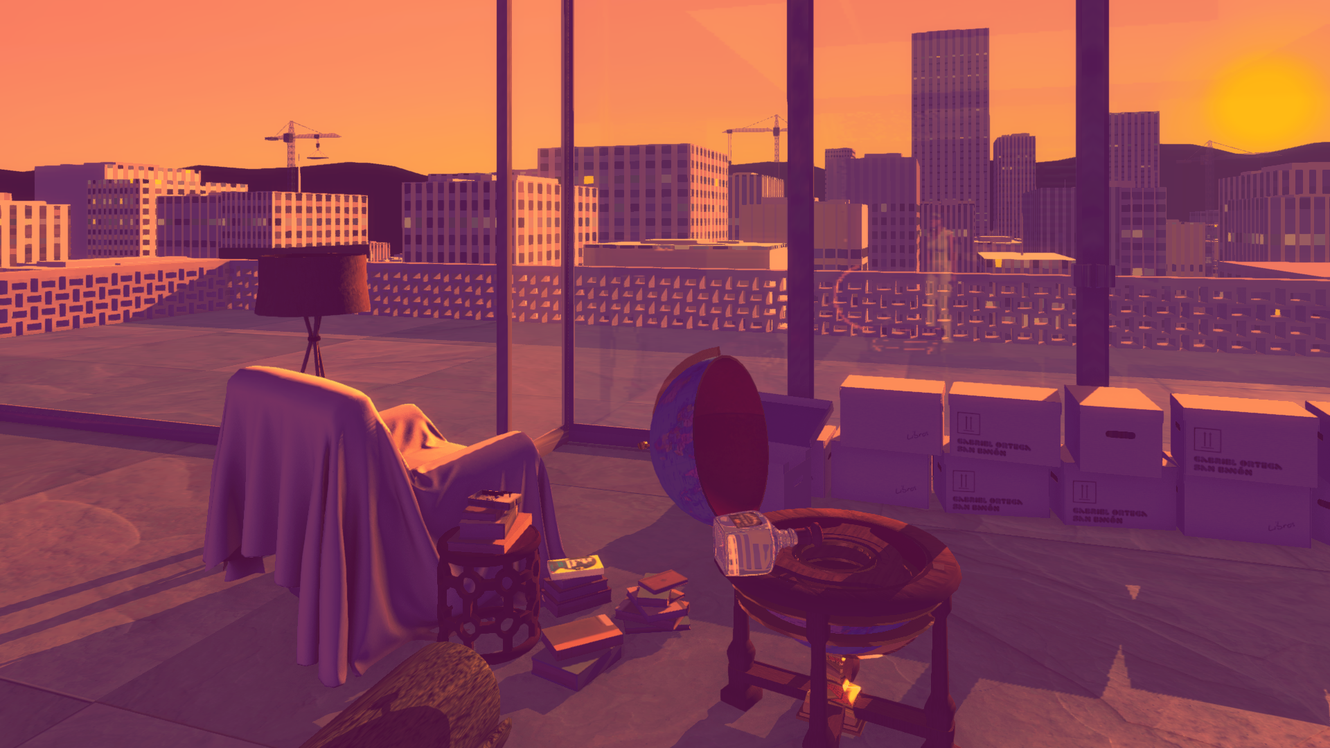
Actual sunset doesn’t look anything like this. But somehow to us this feels like sunset.
Stylizing in the Sunset
One of the tricks we use to pull Sunset away from realism is the exaggerated effect of the setting sun. Realistically speaking, when the sun sets its light diminishes and the effect of light from the sky increases. As a result, the world tends to look more bland and blue at sunset. But in our game it looks saturated and orange. Yet any human totally reads it as “setting sun” because it’s the color of the sun itself.
Another style choice is something we’ve developed over years of creating semi-realistic looking games on a budget. Based on something Fumito Ueda once said about Ico, we try to focus our efforts on the elements that are important, while leaving the others very simple, almost symbolic. This approach meshed really well with the particular seventies style that inspired us with its simple modernist architecture contrasted by detailed artworks and antiques.
A side effect of deviating from reality is that photographs look really weird in our world. And there’s lots of family photos of Ortega, and newspapers and magazines. So Auriea developed a style of fudging with photographic collages, halftone effects, and drawings that makes the pictures still read as photographs but look like they belong in our stylized apartment.
Collaborating with game artist Lucie Viatge, we came up with styles, which give the feel of photos from a distance, while up close are more painterly.
This is at the heart of our aesthetic motivation: things should feel real, but don’t have to look real. And in a medium where images are produced synthetically, not photographically, stylization tends to contribute to feeling real. I think this is because stylization is always subjective and as such an artist can guide the viewer to a place where they think the emotion happens.
A little joke
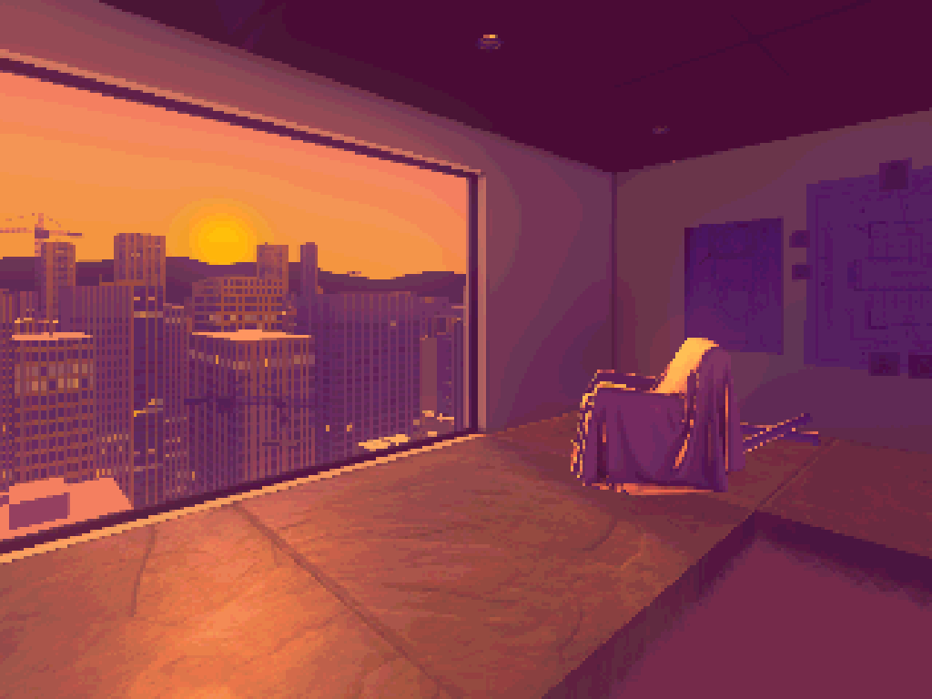
Screenshot taken in Sunset’s MIN mode.
An extreme example of stylization is Sunset’s minimum quality mode. It was created to allow the game to be run on computers without proper graphics processor (ie those pesky integrated things that can only run 3D in theory). By leaving out the shadows and the reflections, the animated character and most of the image effects, we got pretty good performance but the game looked rather bland. So we added a pixellated and slightly posterized effect to that mode. It looks a lot better in our opinion. And as a bonus, it seems to be easier on the stomach of those sensitive to motion sickness in first person.
Escaping reality
Sunset is modeled with mostly realistic proportions, give or take a bit of exaggeration for the sake of realtime 3D videogame presentation. We use reflections, and shadows and shiny materials that have a somewhat realistic effect. But we try to steer clear of anything looking too real. Which, ironically, doesn’t come easy with engines and shaders and scripts mostly created for the purpose of realistic depiction.
But through simplified shapes, generated textures and the extreme lighting conditions that the setting sun allows for, I am quite pleased with how the look of Sunset deviates from reality. And it is precisely the “how” that matters! I hope this means that some art will come out in the process. But that will be your call.